METROPOLITAN ARTS COUNCIL REBRAND
STUDENT PROJECT
I have done extensive design research on The Metropolitan Arts Council, also known as MAC. MAC provides support to area arts organizations, individual artists and arts education programs through various means of donations and volunteering.
I wanted to convey how personable MAC is as an organization. I achieved this by defining their values, and showcasing that it’s when all of their values come together that MAC is set apart as an Arts Council.
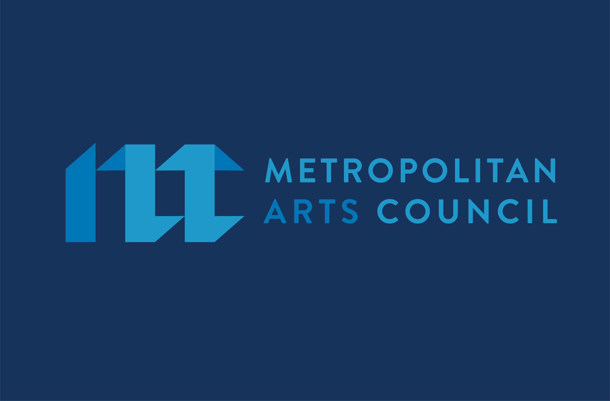
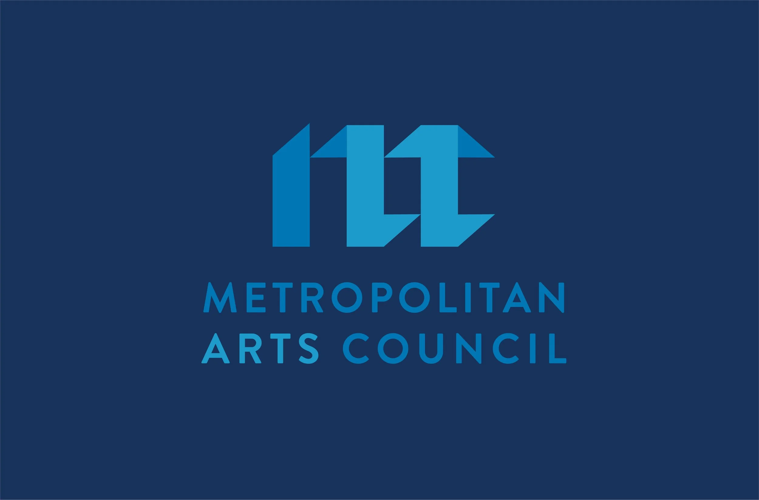
I used this concept of coming together in a visual representation of the main logo. The logo consists of three main letters M, A, and C that come together to form one cohesive mark. The mark was also used in a vertical and horizontal lockup for different touch points.
As for color, MAC had originally used blue for their branding, and I thought it was important to keep equity there. However, I added a secondary color palette to represent the many types of art and artists that MAC supports.


